
Warm Minimalism: The Case for Restraint in Home Design
How limiting a palette to three materials and two tones creates spaces that feel curated rather than sparse.
There is a common misunderstanding that minimalism means empty. In residential design, the spaces that read as minimal — that feel uncluttered, serene, and resolved — are almost always the result of enormous design effort. Restraint is not the absence of decision-making; it is the product of it. Every element that remains has been justified; every element that was removed has been considered.
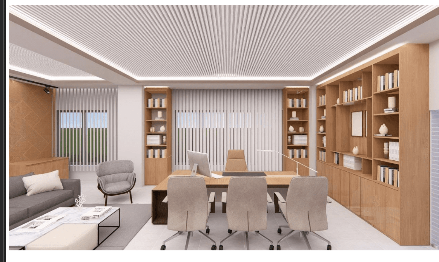
The practical starting point for warm minimalism is material selection. Three is a useful limit: one primary surface material, one secondary, one accent. On a recent project, we worked with off-white limewash as the primary wall treatment, white oak as the secondary material across flooring and joinery, and black oxidised steel as the accent at door frames, handles, and shelf brackets. The result is a space where every material is in conversation with the others — nothing competes, nothing is neutral.
Tone management is equally disciplined. Two tones — a warm light and a deep anchoring dark — applied consistently across the scheme prevent the space from reading as either sterile or muddy. The warm light tone (here, a pale linen) covers the majority of surfaces and bounces light through the room. The deep tone (a near-black charcoal) appears at the floor, at built-in cabinetry bases, and in the steel accents — grounding the composition and preventing the light palette from floating.
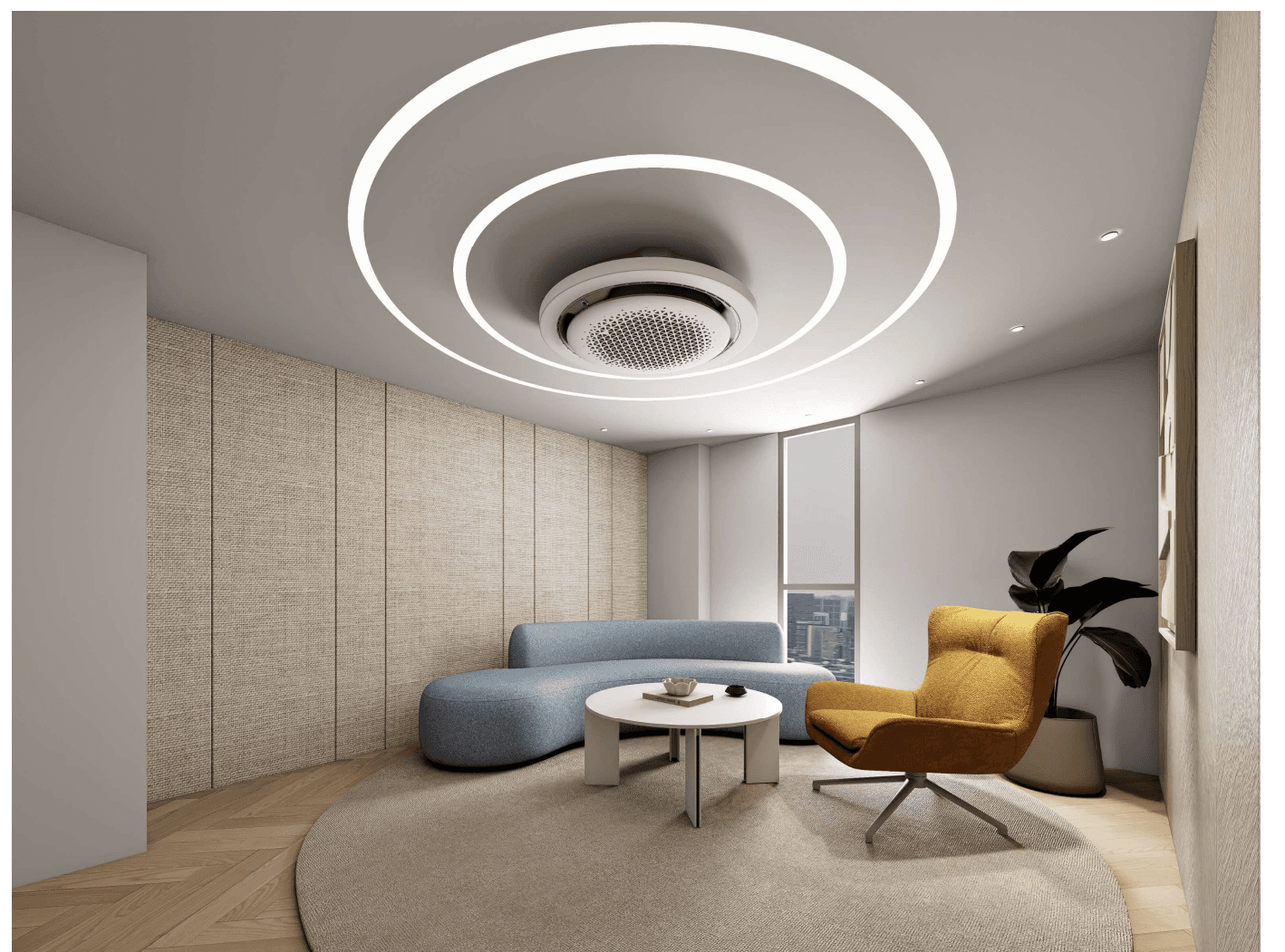
The most common mistake in minimal interiors is over-caution with furniture. Choosing small, recessive pieces in the hope of making a room feel larger actually tends to make spaces feel sparse and unconsidered. Proportionally confident furniture — pieces that take up their full visual weight — creates the sense of completeness that distinguishes a curated minimal interior from simply an unfurnished one.